Expertise
A Brilliant Green for the New Year

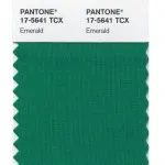
With a new year come new trends – it’s a cycle as consistent and rewarding as the change of the seasons and the calendar itself. The world of design, in particular, welcomes exciting and dynamic changes every year, and 2013 is hardly an exception: Pantone Emerald, often described as a “lively, radiant, lush green,” is the consensus Color of the Year, and agencies worldwide are hopping on board.
“Green is the most abundant hue in nature – the human eye sees more green than any other color in the spectrum,” says Leatrice Eiseman, executive director of the Pantone Color Institute in USA.
Psychological research tells us that green is the color most commonly associated with broadly positive concepts like nature, environmentalism, spring and hope. In short, green never goes out of fashion.
That’s part of why we’ve chosen green as our unifying corporate color and grass (pretty much the epitome of a lively, natural green) as our symbol – we strive to make ourselves and our work a reflection of the lush, radiant and precise green tones that surround us every day.

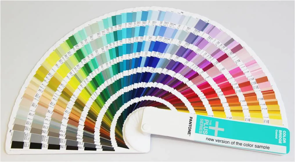
So how does the Pantone color system work?
Pantone colors are special, one-of-a-kind blends drawn from a palette of fourteen base colors. Pantone provides a perfect “recipe” for each and every color, enabling printers to duplicate a colour exactly. It’s like a global, unified dictionary of colors that everyone can use and refer to.
We use Pantone color palettes on a daily basis in our design work, stationery, logo and pretty much every design project we’re involved in. They’re accurate, precise, consistent, reproducible and dynamic. It provides consistent color reproduction, ensures superior printing quality and brings the cost down because there is no chance of mistakes or discoloration, eliminating the need for costly reproduction.
Pantone and precision go hand-in-hand. WILDDESIGN insist on Pantone colors and systems for the perfect color effect, every time.
Our related project: Datacolor – Design of Professional Calibration Tool
Pictures source: Pantone
Häufig gestellte Fragen


